David Borrink is the owner of Arts & Letters, Inc, a small company that specializes in graphic design and editing services. We’ve just loved working with him on WriteShop Primary and watching the project unfold under his designer’s eye.
You and I are so used to zipping down to the store (any store) and buying just about anything ready-made, from food products to clothing to books, yet we rarely think about how those items got there! So I thought it might be fun for you to become a fly on David’s wall and learn how a book actually comes into being.
Kim: I love your company’s slogan, David. What does it say about who you are and what you do?
David: Our slogan is He Draws. She Writes. It’s a simple and clever message that shows how the Lord providentially brought Sallie and me together, not only as husband and wife, but complementary business partners. And Sallie gets the credit for the slogan. I’d say that 95% of the time, people chuckle when they read it. And they remember it.
Kim: In addition to WriteShop Primary, what other sorts of projects are currently on your plate?
David: Let’s see, on my tickler list is:
- a bi-monthly Christian women’s magazine,
- a foundation fundraising promotion for a Christian school,
- promotional materials for a private school marketing company,
- a web site for a commercial janitorial firm,
- packaging and flyers for a turf supply company, and
- assorted items for a hospital in Florida.
So I have a good variety of projects and they’re all over the country, too!
Kim: You and Sallie have a unique partnership. What’s it like to work together on a project like WriteShop Primary?
David: While some preliminary design work can happen, the project really moves after Sallie checks the content. Then I start working on layouts, with occasional discussions with Sallie, who uses her keen eye for what looks good. I appreciate that because I get too familiar with a design and lose that “first impression” that the average person sees. She pushes me to do better all the time, and I think it shows in our final product.
Kim: WriteShop Primary’s layout is just beautiful, so Debbie and I especially appreciate your collaborative efforts! You know, when we pluck a book off the shelf at our local bookstore, most of us never really think about how it got there. What’s actually involved in taking a book from its raw manuscript form to finished, printed book?
David: I’ll take a manuscript and get an idea of how the structure of the book should be set up.
- Are there headings to consider? Illustrations or diagrams needed? Will there be editing needed, yet?
 Then I’ll set up a mockup layout using either actual text or fake copy (gibberish words which look like real text) in order to set up a style.
- When approved, layout of chapters proceeds, with illustrations added if necessary, and then files are sent to the client for review.
- Sometimes at this stage, a book is printed “on demand” to give us an “almost real” book in order to see if what we’re doing is working. It’s one thing to see a layout on the screen, another to print pages out of a printer, and yet another to handle a full mockup.
- Then it’s a matter of reviewing and tweaking the design until we’re satisfied. And of course, any text changes are made along the way. Once we’re finalized, I supply printer-ready files at the printer’s direction, and we’re off to press!
- Another mockup can be made at this time to make sure everything looks as expected and it’s the last chance to change anything. Hopefully, all is correct now and it’s time to print the real books.
 Then I’ll set up a mockup layout using either actual text or fake copy (gibberish words which look like real text) in order to set up a style.
And when the real book lands in your hands, it’s a most gratifying situation. You then think, “Wow, we did this!”
Kim: That’s always our reaction whenever we publish something new! David, what are the considerations and challenges in designing an attractive book layout?
David: Most people don’t appreciate or understand how transparent good book design is. The point of a book is its content, not how well it’s designed. If a book’s design distracts you from what it’s telling you, then it’s not a well-designed book. Therefore, I try to come up with a design that complements the subject matter.
 And how much embellishment a book needs depends on its topic. So for WriteShop Primary, we have used some fun graphic borders and a font called “Kidprint” for some of the headers to make the page fun. After the prototype was created, we decided to change the text font to keep…the content easier to read. Like I mentioned before, we keep reviewing what we’re doing to make the product its best.
Another challenge is the many changes needed throughout the process, especially when a book is heading toward a printing stage. We need to be flexible, and sometimes we’re changing some things at the last second!
One of my old creative directors often said, “Making changes at the last minute is like changing tires on a moving car.” It’s funny, and usually I’ll pull that line out to add some humor to the situation.
Kim: Yep, you’ve shared that little expression with us on more than one occasion! And speaking of changes, our cover has definitely seen a few! Can you give our readers an idea of the process?
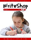
David: Sure. Here are a few covers showing where we came from and where we arrived.
First attempt: I started with basic straight borders and a photo.
Another try: I introduced curves and the oval.
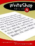
More tweaking with a striped and curved edge, brighter colors, and playful font.
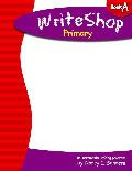
Layout approved! Next I introduced a drawing.
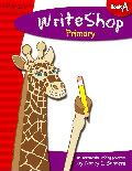
We’re almost there! I added Deborah’s illustration instead and, voila! We finally achieved our goals for the whimsical, eye-catching cover you see below.
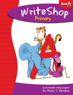
I love what’s transpired here. In collaborating our ideas, we eventually saw the need to bring another illustrator on board to get the look that you and Debbie wanted for the animal characters, and I’m very pleased with Deborah Thomson’s whimsical illustrations.
This is going to be a great set of curriculum when it’s finished, and judging by the comments I’ve read here on your blog, it’s getting a very enthusiastic reception!
Kim here: Check back in a week or so when we turn the tables and interview David’s wife Sallie, the copyeditor for WriteShop Primary. You’ll just love meeting her!