Oh, the excitement is mounting! The talented Deborah Thomson keeps sending us sketches, each one cuter than the one before! Since WriteShop Primary teaches writing for kindergarten, first, and second grades, we especially love the cheerful, whimsical, inviting faces and poses.
Once we settle on our three sketches, Deborah will create a clean drawing of each grouping. Finally, she’ll add color and shading.
Please tell us what you think!
Will you add your two cents? Leave a comment to let us know your favorite grouping from A, from B, and from C. (Three votes altogether.)
- Cover A1 or Cover A2?
- Cover B1 or Cover B2?
- Cover C1 or Cover C2?
In addition, feel free to make suggestions for postures, expressions, or placement. Or maybe you like an animal from A1 that would look better in C2. Please tell us what you think!
So no more waffling…it’s time for us to choose illustrations. Oh, and if it helps:
- Book A has a red-striped border
- Book B has a green-striped border
- Book C has a yellow-striped border
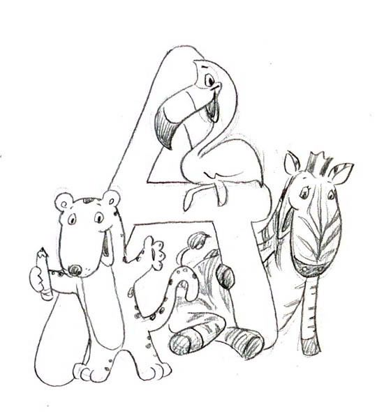
A1. Tiger, flamingo, zebra
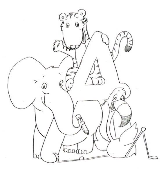
A2. Elephant, tiger, flamingo
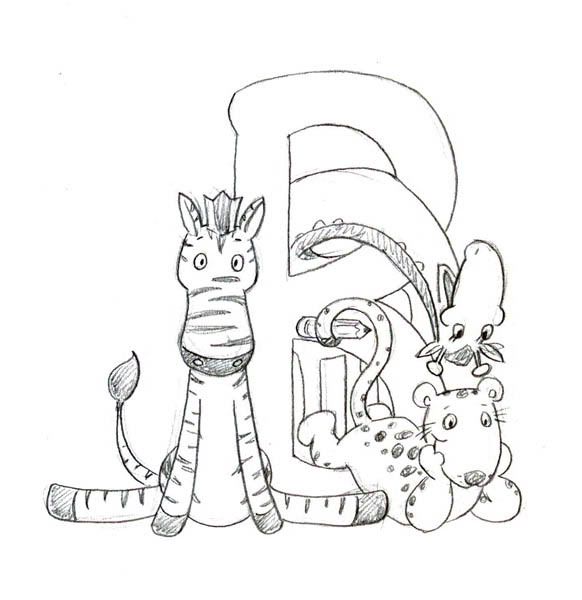
B1. Cheetah, giraffe, zebra
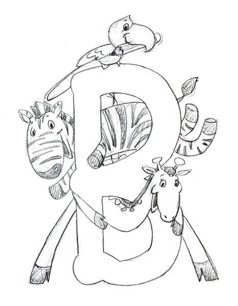
B2. Parrot, zebra, giraffe
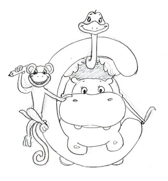
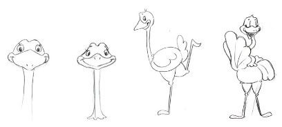
C1. Hippo, monkey, ostrich
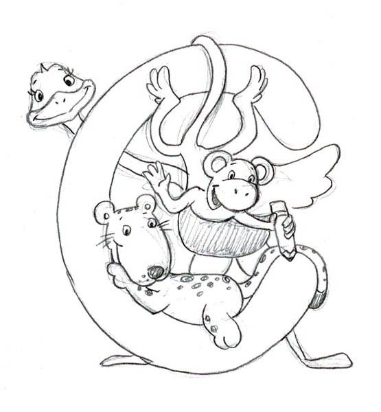
C2. Cheetah, monkey, ostrich
Our cover illustration poll is now closed.
We appreciate each of you for taking a moment to share your faves with us. Thanks to your helpful feedback, we’ve made our decisions! Check back soon to see the finished book covers, beginning today with Book A:
http://www.writeshop.com/blog/2008/04/04/drum-roll-please/
My choices are A2, B2 C1. They are not as busy to me. I prefer the more simple illustrations.
Diane
Hi Kim and Debbie,
I like A1, B1, and C2 …for whatever it’s worth!
A2 (the elephant’s trunk across the letter is nice), B1 (giraffe is so cute), C2 (like the leopard lying in the C like that). They are all cute though!
Oops, didn’t mean to hit “enter” — meant that the tiger’s face is too similar to the zebra’s. If you hadn’t mentioned that it was a tiger, I’m not sure I would have guessed.
A1 (However, the tiger’s face needs to be a bit rounder and shorter. Currently, it’s too similar to the , B2, C2
A2, B1, C2
Kim,
I like A2, B2 and C2. The animals look the happiest and most ‘welcoming’ in those, IMHO. Very cute.
Dana
My son (Jack) and I both agree on A2, B2 and C1.
Now, if you only had an art curriculum so we could learn to draw as well as Deborah!
A2
B1
And C is tough. They’re both really cute. I think I’ll go with C2.
They are all really adorable. She did a great job.
A-2, B-1, and C-2 appeal to me! I had to look twice at the shape of the letter B on B-2, and the placing of the ostrich on top of the hippo is a bit awkward in C-1. Creative critters!!!
I (Elizabeth) like A2, B1, and C2. Molly likes A1, B2, and C2.
okay I get it,
here is my complete thought
A2, B1, C1
hi, they are so cute.
My thoughts were to choose a diagram that both genders could identify with. I chose A2, but I would trade the zebra for the tiger. It is more identifiable. Or else substitute the giraffe for the tiger.
I like A1–in particular I like the way the bird is sitting on the letter. I don’t have a strong opinion about the rest of the animals in A1 or A2.
I like B2 better than B1. In B1, too much of the letter is covered up and the animals are all on the bottom, leaving too much white space at the top. B1 almost has too much white space at the bottom.
I like the simplicity of C1. (However, I will note that the animals in B2 look like they are having more fun. 🙂
They are all beautiful drawings. As a kid, the covers alone would put me at ease–even if it is a school book.
All are really cute.
I like A2, my first gut pick was C1 because I love the hippo (though C2 has more fun action). Now about B. I love the action in B1 the best, though it is covering up too much of the ‘B’. As I said before they are all cute and I don’t think you can go too wrong. 😀
We vote for A2, B1, and C2.
What fun!
My favorites are A1, B1, and C2.
Blessings,
Jeannie
Hi Kim,
I like A2, B1, C2 best, because I like the poses of the animals best. I didn’t think about colors and how they’d co-ordinate with the border though. I also love the hippo – but he wasn’t in my overall faves.
Great minds think alike, huh, JoJo? 🙂
I like A-2 and C-1. Not only are the animals pleasing and friendly looking, the proportion of the animals to the letter is perfect. Those two choices seem more symetrical to me.
A1, B1, C2.
Least favorite: C1.
Blessings~
Hey, thanks for voting, Jennifer! If it helps to clear up any confusion, there are actually three different books, each with a different cover.
Book A is red. Animals will play on a letter “A.”
Book B is green. Animals will frolick on a letter “B.”
Book C is yellow. Animals will cavort on a letter “C.”
So Jeremy will get his wish for a green cover–but it will be on Book B rather than C. I know he’ll love it once it’s finished!
My son, Jeremy and I, both like C2 the best. Jeremy says green border for C2 would look the best. He is very artistic, so I vote for green border too.
A-2, B-1, C-1. Each one is easier to see at a glance as they are not piled on top of each other.
How adorable!! I like A2, B1 and C2 best.
JoJo
A2
B2
C2
They are all cute as can be but I like these the best as the letter seems to stand out a little better.
Wen
Hi, Kim, I love the artwork for all of them, but I did force myself to pick a favorite. Here are my choices:
A2
B2
C2
I can’t wait to see the finished product! Thanks! Have a blessed day! Tami
Thanks, Chris! Say, do you by chance have a favorite from the A and B groups? We have three books to illustrate! 🙂
My vote is for C-2. It is so cute!
Good question, Nancy, and fortunately, one with a simple answer!
The alphabet letter reflects the book level: We’ll use an “A” for Book A, “B” for Book B, and “C” for Book C.
My favorites are the monkey hanging upside down with the pencil in C2 and the elephant holding the pencil in A2. I also like the flamingo with them.
Will they be around a W for WriteShop Primary or what? How do the alphabet letters work in?
Great job!!!